Application of the brand
Logotype with business tagline

Logotype
The FCC logotype comprises two elements, our name and our graphic icon (the arrows ).
There are only two versions of this logotype
A. The corporate logotype
B. The logotype with corporate tagline
The logotype with corporate tagline should be used wherever possible.
The logotype without the tagline should be reserved for cases where the medium or size cannot accommodate the tagline.

The corporate tagline may be translated into local languages when the commercial activity recommends it and with the previous authorization from the Corporate Marketing and Brand Direction.
Options for using the corporate tagline
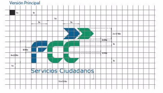
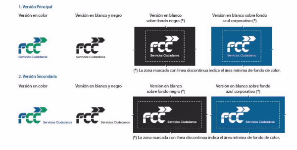
There are two ways of using the corporate tagline:
Main version:
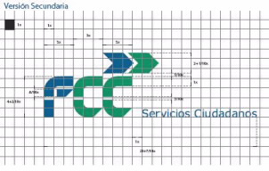
Secondary version:
This version should be used only in landscape format layouts in order to enhance the graphics’s visibility, depending on the size of the logotype.
Color
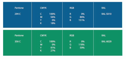
The colour is a constant identifier of the brand
- Pantone 294C(blue)
- Pantone 356 C (green)
Corporate logotype
There are the main color versions of the corporate logotype
- Colour version.
- Black and white version.
- White on black background.
- White on corporate blue background.
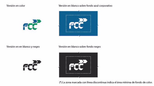
With corporate tagline
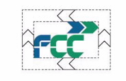
Exclusion zone around the corporate logotype.
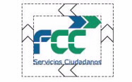
An exclusión zone must be provided around the corporate logotype to ensure its protagonism and integrity in the various applications. The space around the corporate logotype should be free of text and graphic elements to ensure it is legible. The size of the exclusion zone is defined by an space equivalent to the height of the arrows.
With corporate tagline
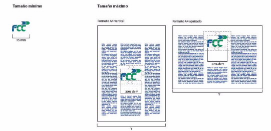
Maximum and minimun size of the corporate logotype.
The minimum recommended size for the corporate logotype is 15 mm wide. As a general rule, The maximum recommended size for using the corporate logotype in portrait formats is 30% of the width of the page/item.
In the case of landscape formats, the maximum width is 22% of the page/item
These proportion are designed for use in documents that contain text.
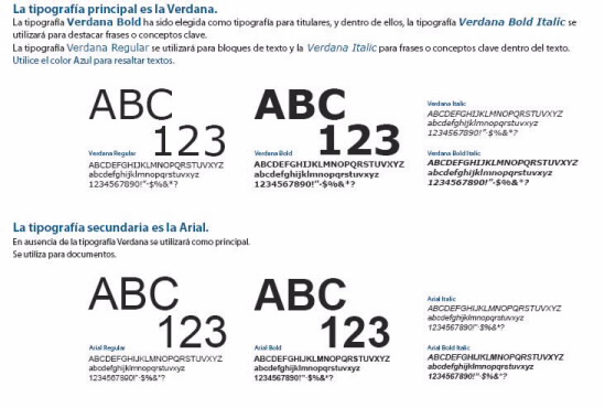
Corporate fonts
